
Not very many authors are drawn into this process, unless their commercial weight is so great that they can’t be avoided. Authors are, by definition, word people, and what they like or don’t like visually may or may not the right thing for a cover. Certainly major authors will be shown cover designs, and may even have veto power, but they seldom get too involved if they know what’s good for them. There’s a reason we don’t read the novels of Claude Monet or go to museums to see the paintings of Mark Twain. Some would say that the circuits of the brain that make one good at words are laid in such a way that one simply cannot also be good at images, and vice versa. I wouldn’t go that far, but in my experience, words are words and images are images, and it’s best to leave each to their appropriate craftsmen.
Kindle tells the aspiring self-publisher to acquire the services of a professional to create the cover. This, like their telling the self-publisher to acquire the services of a professional to help edit the text, is good advice. The only thing anyone will see when they look for your book is that cover image. Unless your name is so important that the image doesn’t matter (and if you look at the images on bestsellers written by the authors of former bestsellers, you’ll usually see the author’s name taking up a lion’s share of the cover geography), then the image matters. Something totally amateurish will simply make people assume that the text is also amateurish. Something unattractive will make people think the text is unattractive. Et cetera, et cetera.
I have not taken Kindle’s good advice on this.
First of all, I don’t want to pay the money. I’m not going into this thinking that I’m potentially making some great fortune, and I don’t want to lose money on the deal. Second of all, I’m not terrible at recognizing decent enough cover imagery. I’m not all particularly skilled at creating it, but I know stinky when I see it. My assumption was that I could put something together that would be okay. And then there was this:
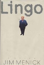
I wanted something that would be what you might call a companion to Lingo’s original cover. As you can see, it’s mostly empty space. I like empty space, and I figured I could probably design empty space as well as the next person. (I like this cover, although I have to admit that, when I first saw it, I was a little taken aback, because my image of Lingo was nothing like this image. But I got over that. It was a pretty nice cover, and it wasn't misleading. And to be honest, nobody ever asked my opinion in the first place. I was just the author.)
This, on the other hand, is the rather generic cover that is floating around now. If I remember correctly, it came about when the book was Print-on-Demand. (I didn't bother stripping out the Amazon stuff when I copied the image over.)
Not quite the same. When I saw this I was a lot taken aback, but realistically, the book had run its course and, well, once again, nobody ever asked my opinion. Say what you will, I was sure that I could do better; I only wish someone had asked.
And so, with an idea to come up with at least something congenial to the original Lingo cover, and using the tools at my disposal, I dug in.
No comments:
Post a Comment